If you've spent any time in the web development world, you've probably heard these two terms thrown around like they mean the same thing. UI library. Design system. People use them interchangeably in Slack threads, job postings, and design reviews, but they are genuinely different things, and mixing them up can lead to some real confusion when you're trying to build something that scales.
Let me break it down in plain terms.
What Is a UI Library?
A UI library (also called a component library) is a collection of reusable, modular components that developers can use to speed up the creation of user interfaces. These include everything from simple components like buttons, dropdowns, and checkboxes, to more complex ones like data grids and data visualizations.
Think of it as a toolbox. It acts as a centralized repository for various UI elements, such as buttons, form fields, navigation bars, and icons. When you reach for something, it's already built and ready to go.
Component libraries are widely used in web and software development, especially in frameworks like React, Angular, or Vue.js to facilitate the development of user-friendly and consistent interfaces. They provide a way to build modular and scalable applications by allowing code reuse and separation of duties.
Popular examples you've probably already used include MUI (Material UI), shadcn/ui, and Chakra UI. MUI, based on Google's Material Design, is one of the world's most comprehensive and widely used component libraries, and it even provides customization through theming so you can separate your UI from competitors, even if they're using the same library.
The big win with a UI library is speed. The most significant benefit is that teams don't have to start from scratch. They can begin prototyping and testing immediately using a thoroughly tested component library.
There's also a consistency benefit that's easy to underestimate. When a team of developers is dividing up the work, two developers might build the same element like a button in slightly different ways when working on different features. Over time, this creates an interface full of components that all work a little bit differently, both for the user and the developer. This makes the UI hard for users to learn and the code challenging to scale and maintain.
A good UI library solves that problem at the code level.
What Is a Design System?
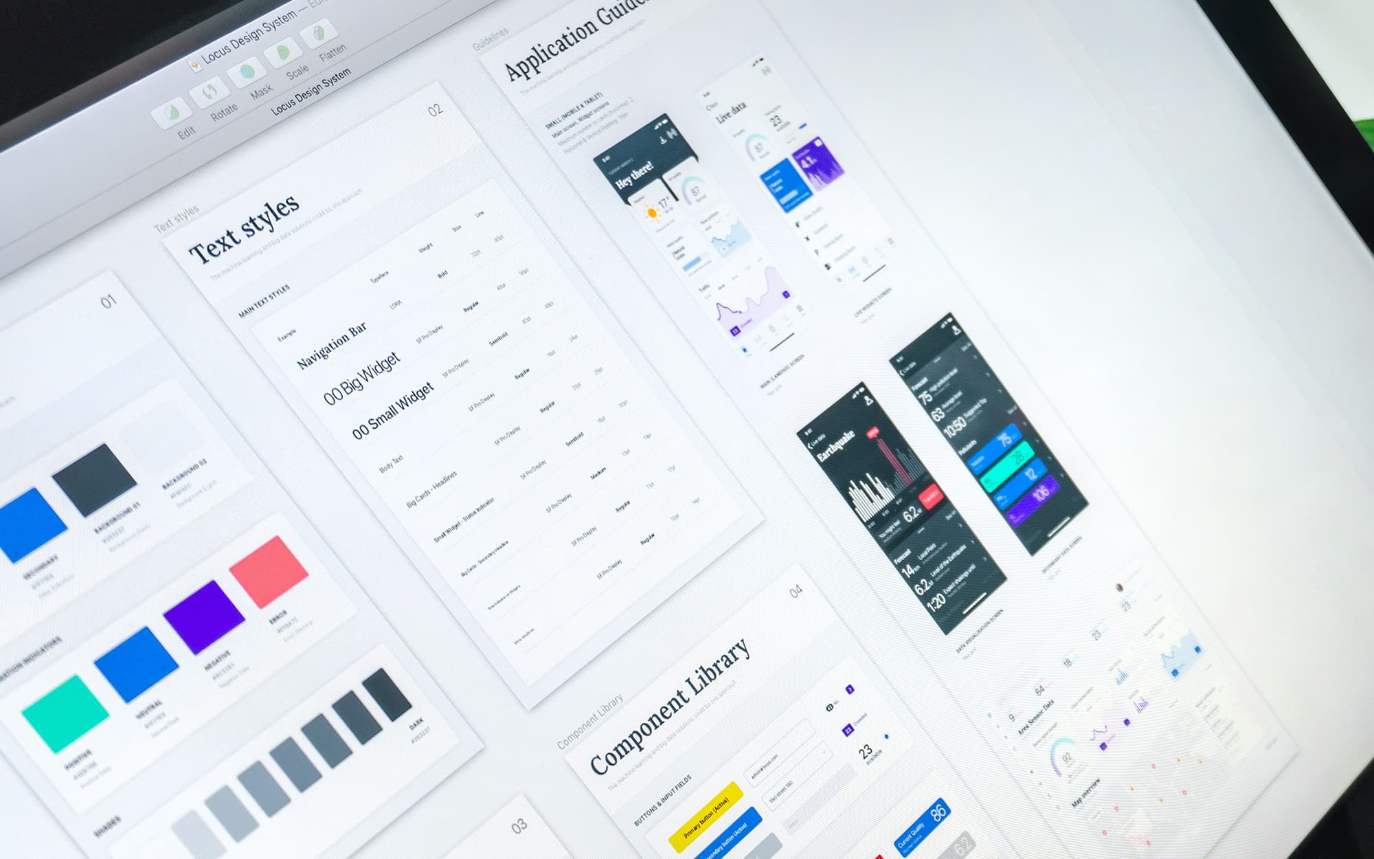
A design system is a bigger idea. A design system is a comprehensive set of standards and rules that guide the design and development of a product. It includes principles, patterns, visual style, accessibility, and sometimes coded components.
A design system is a collection of guidelines, rules, principles, components, and resources designed to ensure consistent and efficient design for a brand, product line, or application. It provides a unified framework and design language to harmonize the look and feel, interactions, and user experience across different platforms and channels.
So where a UI library gives you the building blocks, a design system tells you why those building blocks exist, how they should be used, and what values they're meant to express. A UI library is about "how it looks," while a design system is about "how it looks, how it works, and why it is the way it is."
A design system is a complete set of standards intended to manage design at scale using reusable components and patterns. That word "scale" is key. Design systems are built for situations where multiple teams, multiple products, or multiple platforms all need to feel like they belong to the same family.
A great real-world example is Atlassian's design system. Atlassian, the company behind Jira and Confluence, has built one of the most comprehensive design systems out there, designed to support agile teams throughout the entire product lifecycle. Their design philosophy aligns directly with their mission, and the system is broken down into robust sections covering brand, foundations, iconography, typography, layout, color, accessibility, and illustrations. Contribution guidelines help Atlassian teams embrace the collaborative and ever-evolving nature of a design system, and a whole section on the brand ensures developers create digital experiences that feel like an authentic representation of the Atlassian brand, with reusable components that all provide visual examples, usage guidelines, code snippets, and a changelog.
So What's the Actual Difference?
Here's the simplest way to think about it: a component library is one part of the design system. It can be thought of as a subset of the entire system that includes other building blocks. A component library alone cannot make up the design system. It requires other elements such as a pattern library, branding guidelines, and specific policies and documentation.
While UI libraries excel at promoting visual consistency, they lack the depth and comprehensiveness of design systems. A UI library is a part of a design system, but a design system is much more than just a UI library.
Another way to frame it is through ownership.
A component library should be owned by the frontend team. It's a technical asset, and engineers are best positioned to maintain code quality, manage releases, and ensure integration stability. Design should stay closely involved to align on patterns and visual intent. A design system, on the other hand, is a cross-disciplinary effort. A design system requires a different model. Because it influences product direction, brand expression, and technical architecture, it can't belong to a single discipline.
Which One Do You Actually Need?
This depends entirely on where you are and where you're going.
If you're a solo developer or a small team building a single product, a UI library is probably all you need. Grab something like shadcn/ui or MUI, customize it to match your brand, and ship. You'll move faster and your UI will stay consistent without much overhead.
The difference between a component library and a design system becomes visible when growth accelerates. In the early stages, reusable components may be enough to maintain speed. As complexity increases, structure determines whether your organization scales smoothly or absorbs rising coordination costs.
If you're working on something that spans multiple teams, multiple surfaces, or needs to maintain a strong brand identity across everything it touches, that's when a design system starts paying dividends. Design systems go beyond providing simple building blocks. They establish a complete design language for your digital product. In addition to housing components, a robust system also includes accessibility guidelines and principles around their usage, empowering teams to create high-quality designs consistently across different projects while maintaining brand integrity.
A design system is only as effective as the team that manages it. Whether created or adapted, design systems require continuous maintenance and oversight to ensure they don't become outdated, obsolete, or overcrowded with redundant entries. That's real investment, and it's worth being honest with yourself about whether your project actually needs it yet.
The Bottom Line
A UI library is a set of ready-made components that help you build faster and more consistently. A design system is the broader framework that gives those components meaning, context, and governance. One is a collection of tools. The other is the philosophy behind how and why you use them.
You can absolutely have a UI library without a full design system. And many great design systems include a UI library as one of their core pieces. They're not competing ideas. They're just operating at different levels of scope.
Start with the UI library. Build the design system when your product demands it.